ShopDreamUp AI ArtDreamUp

Deviation Actions
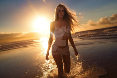


Model Laura MarieObject PillowsObject BedroomLocation Strata Penthouse, Downtown, San Diego, California, USA
Description
This is the first in a new bedroom set that I am doing with Laura.
I can't wait to see them all done and together.
I can't wait to see them all done and together.
Image size
2560x1024px 1.25 MB
Comments20
Join the community to add your comment. Already a deviant? Log In
I've recently become a premium member so I get to chuck in my twenty cents when I see a shot I like.
I definitely like this shot. Here's why.
Firstly the model is just stunning. A stunning model isn't enough for a good image, but it certainly helps.
Tim was clever enough in this shot to keep his depth of field reasonably deep. A great choice. The purpose of this shot isn't for us to gaze into the model's eyes like a portrait (me reading the photographer's mind. Sorry Tim) It is to present a bodyscape that just melts in one's mind. So letting us see the shoes to her eyes all in focus is a great choice.
The lighting is superb. I have always said that we look to the part of the picture where the light is different. Putting the model's face slightly in shadow is a great choice. It lets the highlight in her eyes stand out. It gives us a light scape to follow.
Normally when I take a portrait I focus on the eyes. I am not sure Tim did this in this shot. And I can see why. We don't need her eyes terribly sharp. The curve of her panties on her hip and the delicate patterns have all been preserved because of Tim's focus point. Great choice.
Back to the lighting for a moment. The angle of the light is just perfect. It shows the musculature of the model's tummy and ribs, and gives a lovely tonality across her legs. Love it.
Normally I would disagree with shoes in a bed. For me it often looks too staged which puts me off (my preference is for shots that look as real as possible).
Here I think the shoes in this case though are a great addition. They refine the possible readings we can make of this image (what we think the image means. Academic speak oop)
Without shoes, a woman lounges on a bed. Could be the girl next door, could be anyone. The inclusion of these particular shoes though evokes for me the idea that this woman was just recently in a black dress. Or something similar. That this is a woman with class and style. And that she has left her shoes on could mean she's in a hurry. Who knows.
And this is the thing; all images that really grab me have a story. They tell me something. My mind plays with what I see and tries to assign meaning.
And I think that is what I really like about this image. The model's angle in the bed so that she is leaning towards us down the length of the picture; her expression; The fall off of light; the empty side of the bed on the other side. These are all excellent composition choices.
And finally to choose the white sheets to contrast against the brown of the model's skin also keeps the image simple. I don't find myself distracted by other parts of the image. This is all about the model and it is without doubt one of my favourite shots on DA.
I would provide some criticism so that Tim can improve, but I can't find a single thing to comment about except that perhaps I'd probably clone out the vertical wall join on the other side of the bed against the wall since it doesn't contribute to the picture. Ok, so I found one thing.
Until I mentioned it, did anyone even notice the back wall?
That's how good this image is.